More and more, lighting is living in two worlds—function and art—and we hope that relationship never comes to an end.
Good design borrows the best from the past and improves it to seamlessly move into the here and now. Look for the industrial design revolution to remain with lighting. Without the hard edge, the look brings in a bit more refinement. Look for elements that have sleeker, thinner metals in various tones (deep black or grey tones needn’t define the color story). Subtle details are making their way into the scheme, and don’t be afraid to move industrial inspired lighting out of the kitchen and dining areas. While they work well there, consider adding the vibe to office and living spaces.
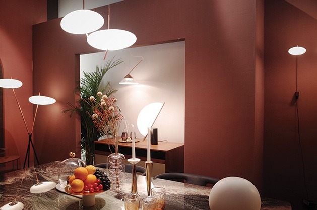
Moving forward in time, Mid-century modern design aesthetics have hit the furniture market. For lighting, it’s been a bit slow in coming, but it’s here. For those who are a bit shy when it comes to embracing a complete Mid-century look, today’s nod to the time period has taken the look from cheesy to easy with clean lines paired with soothing circular shapes. (If you invest in an Eames piece, do it justice, and showcase it with great lighting.)
Gold finishes are popping up, but not in the flashy days of the ‘80s. This time, they’re banking on design inclusion with a softer touch and shouldn’t be confused with brushed gold. Whichever way you go, be sure to consider how the finish will blend with wall color, furniture fabrics and floorcovering.
You can hardly go wrong with a minimalist, subtle lighting sensibility. With movements moving toward less is more, let your lighting drive the statement with low profile, softer geometric designs.
If the desired effect is to utilize lighting as a focal point, don’t hesitate to play with scale. Don’t shy away from oversized shades, or pair large with small; wide with narrow. Design balance can be achieved with a little whimsy in tow.


