We all love color. Color impacts our internal barometers for excitement levels, our ability to relax or be meditative. It influences our thought processes, sways our emotions, and adds meaning to our lives. Color is a Pantone. What? Yes, a Pantone.
The Color Institute is a body of color experts who scour the world, looking for new influences in the world of color that might include nature, politics, sports, social trends and so on. Their mission is to more fully understand how we can use color effectively in all facets of our lives: healthcare, product sales and packaging, graphic design, and home interiors. They are called the Pantone experts, they are also the calculated gamblers of the color world, the predictors of what color we will be loving for the year ahead. These are the people who influence what color is now deemed trend-forward.
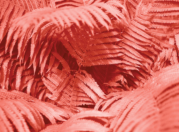
So what’s the 2019 Pantone color of the year? It’s No. 16-1546, Living Coral. It’s called the energizing color of nature and the one that mesmerizes the eye and mind. It makes me feel like eating a peach and having summer back. What’s your color mood?
Sarah Olsen has been an ASID-degreed interior designer since 1993 and is based at Merriment, her Woodbury design studio and retail shop.


